
Understanding Visual Hierarchy — More Than Just Pretty Fonts
Why do some designs instantly make sense, while others feel like a maze?
Let me ask you something: have you ever landed on a website and immediately felt like you knew exactly where to look? Maybe your eyes went straight to a bold headline, followed by a call-to-action button that practically invited you to click. Now consider the opposite—have you ever visited a site and felt uncertain about where to start?
That, my friend, is the power of visual hierarchy—or the lack of it.
At its core, visual hierarchy is the silent language of design. It’s how we guide users’ eyes through a page without saying a single word. Imagine walking into a well-organized store. The store has clear signage, the best products are positioned at eye level, and the checkout line is easily visible. The checkout line is easily visible. That’s visual hierarchy in action.
In UX design, this principle is what helps users make sense of a digital interface. It’s what tells them, “Start here,” “Read this next,” and “Click this when you’re ready.” When used effectively, it removes friction, builds trust, and gently nudges the user toward the desired action.
However, it’s important to note that effective visual hierarchy often goes unnoticed. If you do it right, users won’t even realize how smoothly they’re moving through your interface. They’ll just think, “Wow, this process is easy.” And isn’t that exactly what we want?
So, let’s dive into the tools and tactics that make such an outcome possible.
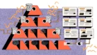
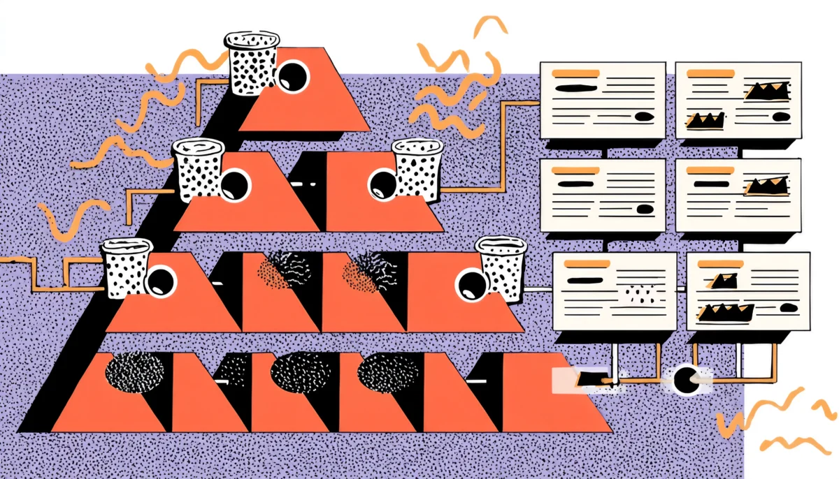
The Building Blocks of Hierarchy
Size, Color, Space—Your Toolkit for Directing Attention
Think of visual hierarchy like composing music. Each element—size, color, contrast, spacing—is a note. When played together with intention, they create a rhythm that guides the user’s journey.
Let’s break it down:
Size (The Loudest Voice in the Room)
When in doubt, go big. Literally. Size is the most immediate way to create contrast. We naturally look at the largest object first. That’s why headlines are bigger than body text. Simple, right? But the trick is in using size sparingly. If everything is big, then nothing stands out. You’ve got to pick your moments.
Color and Contrast (The Emotional Hooks)
Color carries meaning. Red screams urgency, blue whispers calm, and green encourages action. But beyond emotion, color helps create contrast. High contrast between background and text improves readability and clarity. Do you want something to stand out? Add contrast. But again—moderation is key. Overdo it, and your interface becomes a rave party of confusion.
Spacing and Proximity (The Invisible Grid)
Whitespace isn’t empty—it’s breathing room. Think of your layout like a city. Roads (margins) and parks (padding) create flow and give elements room to live. When things are too cramped, users get overwhelmed. The brain perceives elements closely grouped together as related. Use space to create structure.
Typography (The Tone of Voice)
Fonts speak. A serif font might say “traditional and trustworthy,” while a modern sans-serif whispers “clean and tech-savvy.” Hierarchical typography uses different weights, styles, and sizes to guide users through content seamlessly. Your H1 should feel like a bold opening statement—clear, confident, and attention-grabbing. Your H2? It should offer a smooth transition, gently nudging the user deeper into the experience.
Imagery and Icons (The Visual Anchors)
Humans are visual creatures. We process images faster than text. That’s why a powerful image or a well-placed icon can become an anchor point in your design. They’re like highway signs on your user’s journey—fast, clear, and directional.
Applying Hierarchy in Real UX Scenarios
Let’s Talk Buttons, Menus, Forms, and Everything in Between
Now, let’s take a practical approach.
Hero Sections That Actually Convert
The hero section of your homepage is like the first impression on a date. It needs to capture attention without being overly forceful. The headline should be bold and concise. The subheading should be supportive but quieter. The CTA is bright, distinct, and impossible to ignore.
Navigation Menus That Don’t Overwhelm
Similar to airport signage, if a menu requires a second thought, it has already failed. Use size and spacing to group related items. Highlight the most important paths (like “Get Started” or “Pricing”) with color or button styling. Your users would rather not read a novel—they want to go somewhere.
Forms That Don’t Feel Like Paperwork
Ever abandoned a form halfway through because it felt like filling out your taxes? Yeah, same. Break up long forms into digestible steps. Use clear labels and chunk related fields together. The hierarchy here is all about mental flow: what’s most important and what can wait.
Cards, Lists, and Content Blocks
Your best friends are cards. They’re neat, modular, and easy to scan. Use hierarchy to structure each one: a bold title, a supporting image, a snippet of text, and a subtle CTA. The same applies to blog lists, product grids, or pricing tables.
There is no universal solution for visual hierarchy. It’s about context. What’s most important to the user in that moment?
Applying Hierarchy in Real UX Scenarios
Let’s Talk Buttons, Menus, Forms, and Everything in Between
Enough theory. Let’s get practical.
Visual hierarchy isn’t just for homepages—it’s everywhere users interact. Here’s how it plays out in key UX components:
Hero Sections: Lead With Confidence
The “handshake moment” occurs in the hero section. It should immediately tell users who you are, what you offer, and what to do next.
Example:
Dropbox uses a clean hero with one short headline: “Keep life organized and work moving.”
A single blue button: “Find your plan.”
No fluff. The visual journey: Headline → CTA → Background Illustration.
Forms: Reduce Cognitive Load
Long forms intimidate users. Use grouping, spacing, and headings to chunk content. Guide users step-by-step, visually and logically.
Example:
Instead of a 15-field sign-up form, break it into three steps. Use progress indicators. Bold the current step’s title and gray out the others. The user instantly knows where they are and what’s next.
Buttons and CTAs: One Action to Rule Them All
Don’t make users choose between five buttons. One clear, primary CTA is usually enough. Use hierarchy to suggest that action, not demand it.
Example:
Netflix’s signup page uses a big red “Get Started” button under a short input field. All other links are secondary in size and tone.
Content Sections: Skimmability Is Key
No one reads websites like a novel. People scan. Use headers, bullet points, and bold text to guide that scan.
Example:
In an FAQ section, use accordion cards with bold titles. When expanded, the answer uses clear spacing and a readable font size. That structure makes a long list digestible.
Testing, Tweaking, and Trusting the Process
Hierarchy Is Not Static—It Evolves with Feedback
Let’s bust a myth: Visual hierarchy isn’t something you set and forget. It’s fluid, and the best designs are often shaped by real user behavior.
Here’s how you refine it:
The Blur Test
Take a screenshot of your layout, blur it, and squint. What stands out first? That’s your dominant element. Is it the CTA? Great. Is it a footer link? Uh-oh.
The Five-Second Test
Show someone your design for five seconds. Ask what they noticed. If they can’t identify the value proposition or call to action, the hierarchy needs work.
Heatmaps & Click Data
Use tools like Hotjar or Crazy Egg. They show where users click, scroll, and ignore. If 80% of users miss your CTA, that’s feedback you can’t afford to ignore.
Example:
On one project, I redesigned a product landing page where users were skipping the CTA. It turned out that the CTA was placed below a large image gallery. We moved it up, gave it contrast, and click-throughs jumped 32% in a week.
A/B Testing Hierarchy
Try two versions of a layout—one with a big CTA at the top, one with it embedded mid-content. See which performs better. Sometimes, even a 10px change in font size can shift user behavior dramatically.
Design is iterative. Think of visual hierarchy like seasoning a dish. If the visual hierarchy is too bland, users will not engage. If there is too much, users become overwhelmed. Please ensure the balance is achieved through testing.
Hierarchy Is the Heartbeat of UX
If design is a conversation, hierarchy is the tone and rhythm. It tells users what’s important, what’s next, and what can wait.
It’s not just about making things look good—it’s about making them feel right. You want your users to instinctively know where to go, what to read, and what to do next. That’s the art of visual hierarchy. It’s subtle. It’s powerful. And it’s often invisible when done right.
So as you sketch out your next wireframe or polish your next mockup, ask yourself:
- What’s the most important thing here?
- What do I want users to see first?
- Am I using size, contrast, and spacing intentionally?
Because great UX aims not to wow users with flashy visuals, it guides them effortlessly toward clarity, action, and satisfaction.