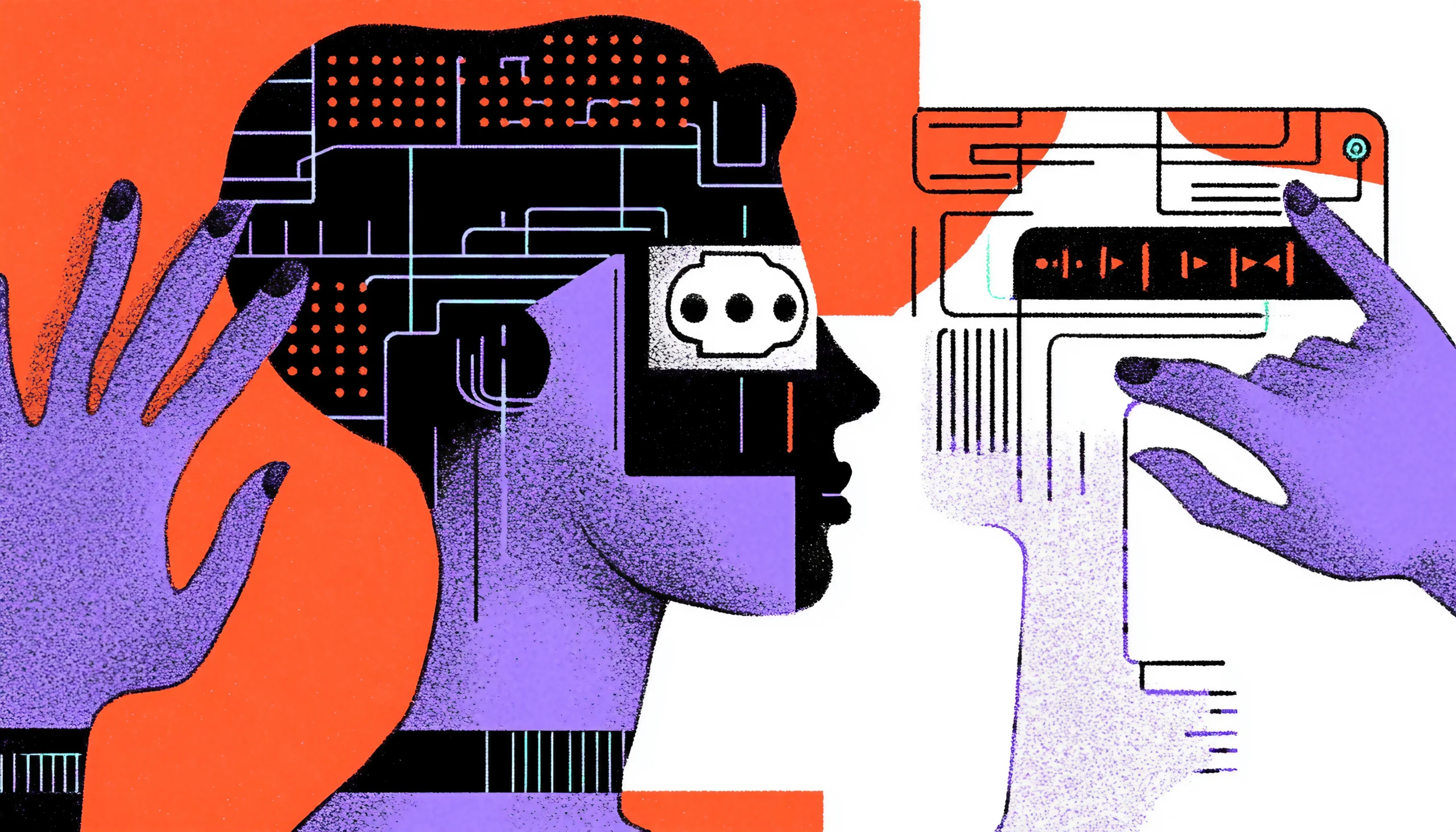

Why Animation in UX Design Matters
Ever come onto a website or program that seemed slow, unresponsive, or just plain boring? Chances are it lacked a carefully considered animation plan. In UX design, animation serves to guide users, improve interactions, and provide natural digital experiences rather than only aesthetics.
Consider it—our interactions in the actual world are dynamic. A button you press moves. Drop something and it falls. UX’s animation replicates these natural reactions, giving interfaces an understandable and captivating feel. But just what part does animation really play in UX design? Let’s get right to it.
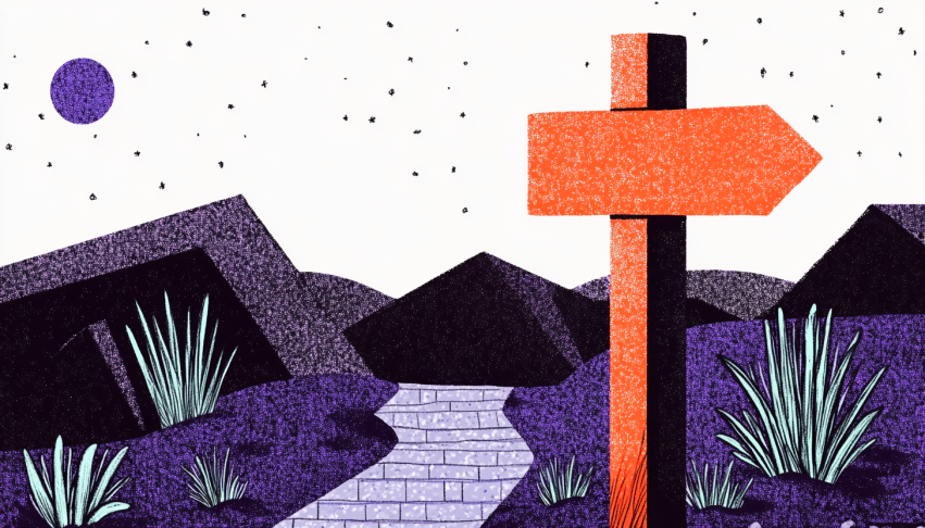
Guiding Users: Animation as a Visual Cue
Motion as a Signpost
Have you ever felt totally bewildered trying a new app? Acting as a visual guide, good animation can clear that ambiguity. When used properly, motion clarifies for users what is happening on the screen and where they should pay their attention.
For instance, a little shake in the input box indicates a mistake when you turn in a form, just like a human shaking their head to say “no.” Alternatively, a menu’s seamless sliding in from the side naturally indicates to the user where it came from and where it will go upon dismissals. These little encounters create familiarity and confidence, which helps the experience to seem flawless.
Directing Attention Subtly
Ever find that pop-ups that fade in feel less invasive than ones that just show up out of nowhere? Animation guides focus without resorting to violence. Simple transitions—like fading or scaling—allow you to gently prod users toward key activities without overwhelming them.
Good animation lets consumers concentrate on what counts without distracting them. It’s like a tour guide gently pointing you in the correct path without yelling directions at you.
Hierarchy and Flow
Additionally, strong visual hierarchy created by animation helps consumers to understand information more easily. Progressive disclosure methods, for instance, introduce material gradually via motion, therefore reducing information overload. Elements can show sequentially, guiding users step by step rather than everything at once.
To indicate that an interactive element is clickable, subtle motion on hover—such as a button slightly expanding or an icon bouncing—can enhance usability. These microanimations reinforce functionality and make the interface feel more intuitive.
Providing Clarity and Feedback
Users need reassurance that their actions have been recognized. Real-time feedback through animations reduces uncertainty and frustration. Ever pressed a button and wondered if it worked? Should you tap again? Simple visual cues—like color changes, ripple effects, or scaling motions—confirm interactions, ensuring a smoother user experience.
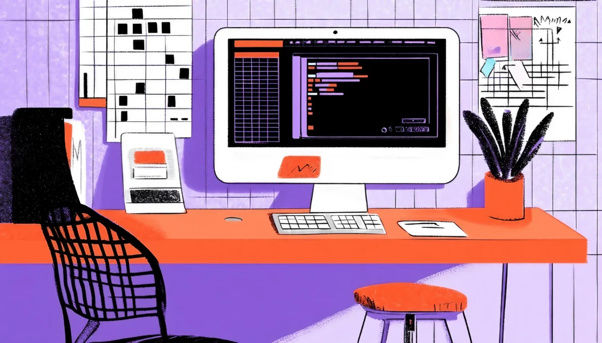
Loading animations play a crucial role in user feedback. Whether it’s a spinning wheel, a progress bar, or a skeleton screen, these indicators reassure users that something is happening behind the scenes. By providing visual feedback, progress indicators keep users engaged, reduce frustration, and minimize anxiety caused by perceived inactivity.
Encouraging Exploration
Hinting at hidden features, animations can gently inspire consumers to investigate a product. To improve discoverability, one can flip a swiping gesture, exposing more content, or a card that tilts slightly. These signals encourage users to interact with components they would have missed, therefore enhancing the general usability.
Designers may produce more simple, interesting, and user-friendly experiences by carefully including animation as a guiding tool. Whether it’s guiding attention, bolstering hierarchy, or offering clarity, motion should always have a function. Done correctly, animation feels natural and helps digital interactions to feel more like real-world experiences.
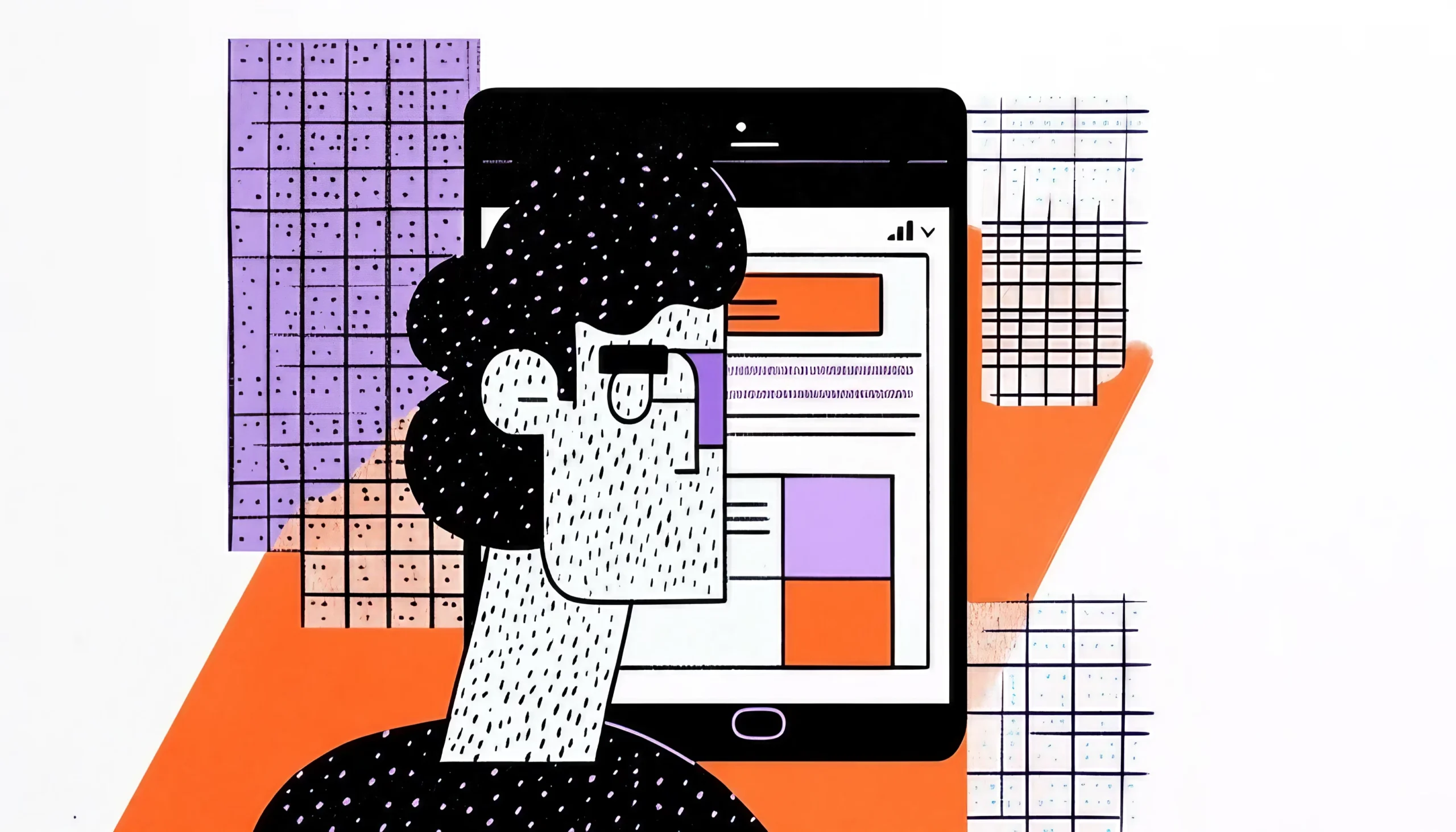
Creating a Smooth, Enjoyable Experience
The Magic of Feedback
Imagine pressing ‘Enter’ in a search bar, and nothing happens—no loading spinner, no response, just silence. Frustrating, right? That’s where animation becomes essential. A progress bar or a small loading spinner reassures users that something is happening behind the scenes.
In UX, this is known as visual feedback and is absolutely vital. Users of an interface anticipate a reaction—just like in real life. You would think an elevator button would light up. Should it not, you press it one more. Digital items ought to be the same. Animation gives interfaces life and response by bridging the distance between action and reaction.
Making Transitions Feel Natural
UI changes suddenly might be startling. Imagine if every time you moved tabs in an app, the screen changed without any transition. It would seem like unexpectedly teleporting to another place without notice. Rather, seamless transitions—such as sliding, fading, or zooming—help consumers psychologically absorb changes, therefore enhancing the comfort of the experience.
Consider it as turning pages in a book instead of having the pages automatically change without movement. The latter would seem strange, wouldn’t it?
Enhancing Engagement Through Motion
Animation applied correctly gives interactions a more lively and interesting quality. Imagine a chat app where messages slide up elegantly or an e-commerce website where a product image gently expands when hovered over. These movements produce a sensation of fluidity and pleasure that transforms interactions from mechanical to gratifying.
Keeping Users Oriented
Users of an app or website must perceive consistency as they move throughout it. Transitions between pages or sections can seem sudden and perplexing without seamless animation. By letting users track movement and preserve spatial awareness, animation closes this distance. A back button that smoothly brings items back into view, for instance, indicates a return to the previous page and hence reinforces a user’s mental model of navigation.
Designers may make digital experiences seem more connected and understandable by gently incorporating animation into user flows. Motion brings fluidity; hence, interactions become not only more fun but also more predictable.
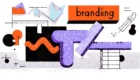
Adding Personality and Brand Identity
Motion as a Brand Element
Ever notice how some brands simply feel a certain way? Apple’s animations are sleek and exact; Airbnb’s are soft and welcoming. This is not by mistake; animation is a very effective branding technique.
A brand’s motion style can shape the entire user experience. A financial app may opt for sleek, minimal transitions, while a playful app might use bouncy, spring-like animations. These subtle choices reinforce brand identity and create a cohesive experience across all touchpoints.
Emotional Connection Through Animation
People are built to react to motion. A little, happy animation—like a heart bouncing when you like a post—can arouse feelings and give an interaction meaning. Though it’s a little detail, it greatly influences consumers’ impression of a product.
Establishing Brand Consistency
Consistency in animation style over several platforms and touchpoints enhances brand identification. Whether a user interacts with a company’s website, mobile app, or software, a consistent and professional experience is created by known motion patterns. It promotes respect and confidence, therefore strengthening the special quality of the brand.
The Role of Playfulness and Delight
Animation may be wonderful sometimes, not only practical. Including unexpected motion—that of a humorous bounce upon completion of a task—improves customer pleasure. These small pleasures help the brand to seem more human and approachable, therefore boosting consumer involvement and loyalty.
In UX design, animation is not only visual candy; rather, it’s a vital instrument for directing users, increasing usability, and strengthening brand identification. It gives digital encounters a human, understandable, and interesting quality.