

Accessibility is a topic often spoken about in the UX design world, but are we truly making our designs inclusive? Building for accessibility means ensuring that all users, including those with disabilities, can easily access and engage with digital products. It’s more than just meeting standards; it’s about making real, positive changes for people. So, how can you make sure your designs are accessible to everyone? Let’s dive into some practical tips and best practices that go beyond the basics.
Why Accessibility Matters
While accessibility may appear as an additional feature, it encompasses much more. It’s like building a bridge that connects users to your content, regardless of their physical, sensory, or cognitive abilities. Imagine trying to cross a river with no bridge—only a select few might be able to make the jump. Designing for accessibility is like laying down that bridge, allowing everyone to cross effortlessly. Just as wheelchair ramps help people access physical spaces, accessible design practices allow all users to engage with digital spaces, even if they can’t interact with them in a “typical” way.
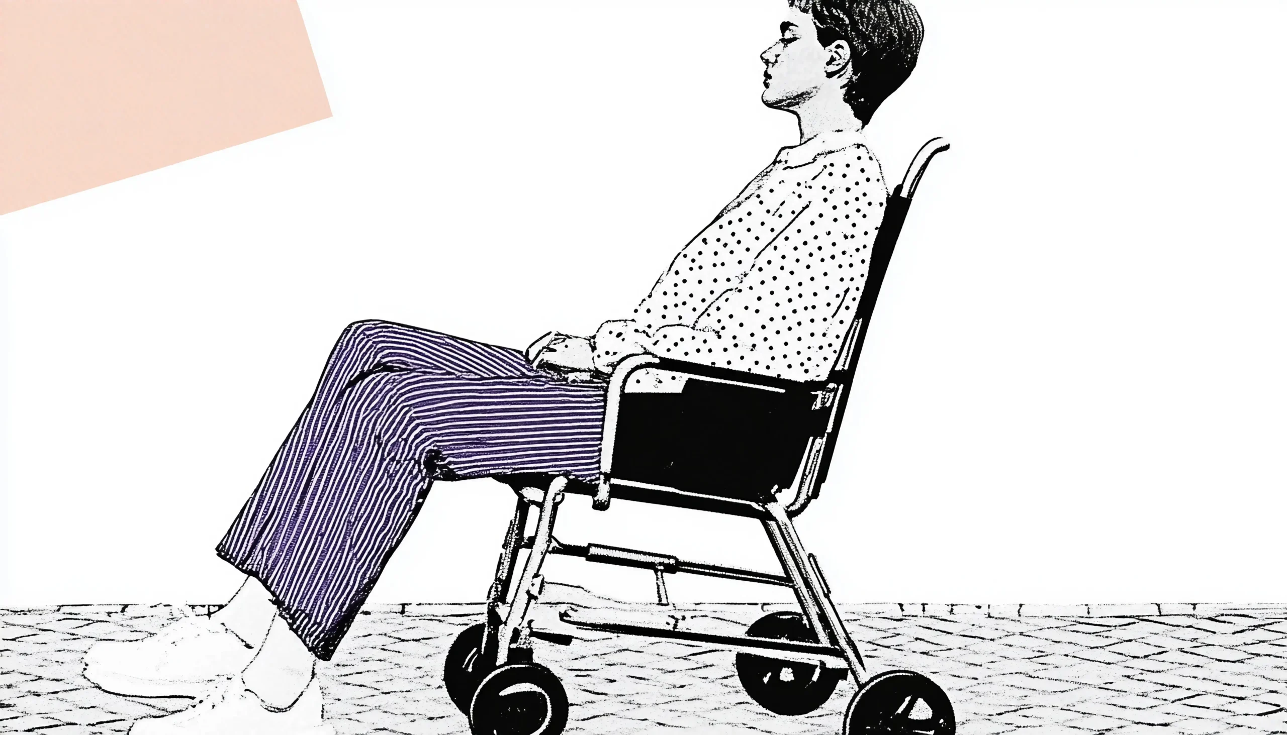
When we ignore accessibility, we’re essentially closing the doors on millions of users. Consider this: in the U.S. alone, nearly one in four adults lives with some form of disability. That includes a wide range of conditions, from visual impairments like color blindness or low vision to motor disabilities that make it hard to use a mouse. Then there are cognitive disabilities, which can affect memory, comprehension, or reading ability. That’s a staggering number of people who could struggle to navigate poorly designed sites.
Imagine a visually impaired user relying on a screen reader to interact with a website. If the page isn’t properly structured with headings and descriptions, the screen reader will get confused, jumping between sections or reading irrelevant information. That’s like trying to follow a GPS that keeps taking you down random roads—frustrating, right?
Beyond Compliance: Real-World Impacts of Accessibility
Accessible design isn’t just the right thing to do; it makes business sense by expanding your audience and boosting user satisfaction. For example, if your e-commerce site isn’t accessible, you’re likely to lose out on sales from customers who struggle to navigate it. Imagine a user with limited hand mobility trying to navigate a checkout form. If form fields aren’t clearly labeled or are too small to click on easily, they might give up out of frustration and shop elsewhere. Accessible design is a chance to build relationships, trust, and loyalty with a broader base of users.
Accessibility also contributes to better SEO. Many accessible practices, such as using proper HTML tags, meaningful alt text for images, and clear headings, align with search engine optimization best practices. By designing with accessibility in mind, you’re not only catering to disabled users but also enhancing your site’s visibility and discoverability.
Isn’t it worth making a few adjustments that have a huge impact? When you put in the effort to make your site accessible, you’re not only adhering to standards but also creating an environment that welcomes everyone—whether it’s someone with a temporary injury or an elderly user who needs larger text. In the end, accessibility isn’t just a feature; it’s a foundational aspect of design that ensures your content and experiences are open to all.
Color Contrast: Make It Easy on the Eyes
Ever tried reading yellow text on a white background? It’s almost impossible, right? Low-contrast colors can make your content difficult to read, especially for users with visual impairments. High contrast is a fundamental aspect of accessible design. When you choose colors, aim for a contrast ratio of at least 4.5:1 for normal text and 3:1 for larger text. This way, users with low vision or color blindness can still clearly distinguish between elements on the page.
Tips for Using Accessible Colors
To check color contrast, tools like the WebAIM contrast checker or Adobe’s color contrast tool can be invaluable. You can quickly see if your color choices meet accessibility standards. Another pro tip? Avoid relying solely on color to convey meaning. For example, if you’re designing a form and marking required fields in red, also add an asterisk or label so users who are colorblind know which fields are required.
Did you know that not all users rely on a mouse? Many users with motor disabilities, as well as power users, prefer keyboard navigation. This is where “tabbing” comes into play. When designing, ensure that users can navigate your site using only the keyboard by moving through interactive elements like links, buttons, and form fields in a logical order.
Key Tips for Keyboard Accessibility
Make sure every interactive element is reachable and operable via the keyboard. Test it yourself! Start at the top of your page and try using the Tab key to go through your site. If you can’t reach certain buttons or links, those elements aren’t accessible. Adding visual focus indicators—such as a border around the active element—can also help users keep track of where they are on the page.
Screen Readers: Speaking the Language of Accessibility
Screen readers are software tools that convert digital text into synthesized speech, enabling visually impaired users to navigate your content. Designing with screen readers in mind means structuring your page so it “makes sense” when read aloud. Imagine a screen reader as a person “reading” your site to a user—would they be able to describe every part of it accurately?
Tips for Screen Reader Compatibility
For screen reader accessibility, always use proper HTML tags and ensure elements are labeled clearly. Headings, for example, help screen readers understand the hierarchy of content, so use them logically and avoid skipping levels (like going from an H1 to an H3). For images, include descriptive alt text, not only for SEO but also for users who rely on screen readers to “see” what’s on the page.
Accessible Forms: Making Interaction Effortless
Forms are a big deal in accessibility. Filling out a form may seem simple, but for users with disabilities, it can be a challenge if not properly designed. Think about it: a form without proper labels, guidance, or error messages is a bit like a maze without a map.
Form Design Tips for Accessibility
Label every field clearly, and place the label close to the field it describes. Use placeholder text sparingly, as it can disappear once a user starts typing, potentially leaving them confused. When an error occurs, don’t just highlight it in red; provide a clear message about what went wrong and how to fix it. Think of these tips as the guideposts that help everyone get from “start” to “submit” without a hitch.
Responsive Design: Accessibility on All Devices
Nowadays, people access websites on all sorts of devices, from large monitors to tiny phones. A good design adapts seamlessly to these various screen sizes and orientations. But when you’re designing for accessibility, responsive design isn’t just a trend; it’s essential. For instance, small touch targets can be a problem for users with motor impairments, so make sure buttons and links are big enough to tap easily on smaller screens.
Tips for Responsive Accessibility
Avoid relying on hover actions alone, as mobile users can’t “hover.” Make sure interactive elements respond to clicks and taps as well. Another tip is to allow users to zoom in. While it’s tempting to lock the viewport to avoid layout issues, this can prevent users with low vision from enlarging the text to a comfortable size.
Multimedia Accessibility: Caption, Describe, and Engage
Videos, images, and audio add rich content to your site, but they can also create barriers if not handled carefully. Imagine being deaf and watching a video without captions, or being blind and coming across an infographic without a description. For a fully accessible experience, multimedia content must be inclusive too.
Making Multimedia Content Accessible
For videos, always include captions and, if possible, a transcript. Captions are especially helpful for deaf or hard-of-hearing users and people in sound-sensitive environments. Alt text is a valuable tool for conveying the content of images. In some cases, especially for complex visuals like charts, a longer description may be necessary to give users the full picture.
Accessibility Beyond Compliance
When diving into accessibility, it’s easy to get wrapped up in technical requirements and guidelines, but we must remember the ultimate goal: creating a space that welcomes everyone. Accessibility is more than meeting legal standards or checking a box; it’s a design principle that, when applied thoughtfully, enriches the experience for all users. Imagine accessibility like good lighting in a building. Proper lighting helps everyone find their way and feel safe—whether it’s someone with low vision, a parent with a stroller, or a person carrying heavy bags. Similarly, accessible design makes your site approachable and usable for a broad range of individuals, regardless of their abilities.
Think about adding captions to videos. Yes, it’s a requirement for accessibility compliance, but it also benefits anyone watching videos in a noisy environment or non-native speakers who might find it easier to read than to listen. Or consider keyboard navigation. While essential for users with motor impairments, it also improves the experience for power users who prefer quick keyboard shortcuts over using a mouse. The more people you can serve with thoughtful, accessible design, the more inclusive and valuable your product will be.
Testing: Beyond Automated Tools
Testing for accessibility is essential, but automated tools alone won’t capture everything. Tools such as WAVE or Axe can be highly effective in identifying minor issues such as missing alt text or contrast, which can be quickly resolved. However, they can’t replace real-world testing with actual users, especially those with disabilities. For example, an automated tool might report that all links are functional, but a screen reader user might still struggle to understand their purpose if they aren’t descriptively labeled. It’s like relying on spell-check for editing a book—it catches typos but can’t ensure clarity or coherence.
Manual testing with real users offers insights that automated tests simply can’t provide. Ask users with visual impairments to navigate your site using a screen reader, or have users with limited mobility try filling out a form with keyboard-only navigation. You’ll learn how intuitive (or frustrating) your design truly is. This kind of testing provides valuable feedback that helps you refine your site beyond compliance standards, creating a genuinely inclusive experience.
Remember, accessibility isn’t a one-time checklist—it’s an ongoing commitment. As technologies evolve, so do the ways people interact with digital products. By continually testing, refining, and improving accessibility, you ensure your design remains relevant, user-friendly, and welcoming for everyone, no matter how the digital landscape changes.

Design for People, Not Just Compliance
At its core, designing for accessibility is about designing for people—all people. It’s easy to view accessibility as just a set of regulations, but building with accessibility in mind means fostering genuine connections. It’s a way to demonstrate that you respect and value every user’s experience, regardless of their abilities. Imagine being a host who goes the extra mile to ensure every guest feels welcome and comfortable. Accessible design is the digital equivalent of that—it’s about creating an environment where everyone feels included and valued.
Next time you start a design project, ask yourself: is this truly inclusive? For instance, if you’re designing an e-commerce site, consider whether all users, regardless of their abilities, can effortlessly navigate from browsing to checkout. Think about color contrast, keyboard navigation, alt text, and more, but also think about the experience as a whole. Does the layout guide users smoothly, or does it create obstacles? Accessibility is about seeing through users’ eyes and anticipating what they might need, then providing it intuitively.
Design isn’t just about making things look good; it’s about making them work for everyone. True accessibility is where empathy meets innovation, creating experiences that welcome all.
The Rewards of Inclusive Design
Yes, making designs accessible requires time and effort, but the benefits are well worth it. Accessible design broadens your audience, enhances user satisfaction, and builds trust. When users feel that you’ve considered their needs, they’re more likely to engage deeply, return frequently, and recommend your site or product to others. In essence, accessible design creates opportunities for individuals who might otherwise struggle with your content. And that’s what great design is all about: connecting with people, solving real problems, and creating experiences that are enjoyable for everyone.
Isn’t it fulfilling to know that your work helps people, breaking down barriers rather than creating them? In the end, accessible design isn’t just an obligation; it’s an opportunity to make a positive impact on people’s lives. It’s about embracing the idea that when we design for inclusivity, we’re designing for humanity itself.