


There’s something almost magical about a well-designed product that just clicks. Think about your favorite app or website—why do you keep going back to it? Maybe it’s functional, maybe it’s fun, or maybe it even makes you feel like it knows you and really understands what you need. That’s emotional engagement in action.
Emotional engagement is the key to designing experiences that stick. It’s the difference between a product that simply works and one that users actually love. So, how do you infuse emotion into your designs? Grab a cup of coffee, and let’s dive into the world of emotionally engaging design through a few stories, examples, and techniques that you can start applying today.

The First Step: Understanding What Emotional Design Really Means
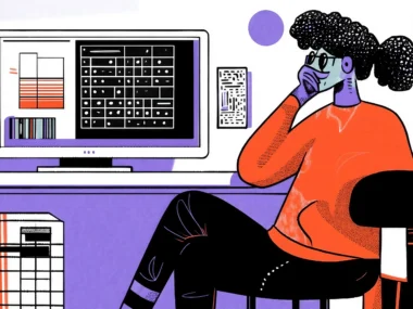
Let me take you back a few years. Picture yourself opening a basic, straightforward app on your phone. Maybe it’s an early-2000s banking app. The design is… well, let’s just call it “utilitarian.” You can check your balance, transfer funds, and maybe pay a bill or two, but let’s be honest: you’re using it because you have to, not because you want to. The color palette is gray and beige, the layout feels a bit like an Excel spreadsheet in app form, and the buttons are so tiny you’re sure they’re secretly testing your dexterity. And that’s just the interface. There’s no personality, no warmth, no spark. It’s the equivalent of drinking gas station coffee—sure, it works, but you’re not savoring it.
Imagine an app that doesn’t just help you get the job done but also makes you feel a little happier in the process. It’s like the difference between the coffee you grab in a hurry and a lovingly brewed cup from your favorite café. You know, the one where the barista greets you by name and creates a heart in the foam? Emotional design is like that handcrafted coffee. It goes beyond the “serviceable” stage to add a layer of connection, thoughtfulness, and delight. It’s there to help you accomplish your task, sure, but it’s also designed to make you feel good along the way.
And that’s the heart of emotional design. It’s about getting to know your users on a deeper level—not just who they are, but what makes them tick. Think of it this way: you’re not just creating an app; you’re crafting an experience that resonates with their feelings, motivations, and even dreams. You’re aiming to make users feel seen, understood, and yes, maybe even a little bit happier.
Imagine an app that’s a little like a personal cheerleader in your pocket. Instead of flat “You’re all done” messages, it could say something like, “You crushed it today!” Or instead of a boring home screen, it could greet you with a personalized dashboard, complete with friendly animations or a splash of your favorite color scheme (because, yes, you did tell them you like the color blue, and they remembered). Emotional design is about making users feel like they’re not just interacting with code but with a product that “gets” them—one that’s more like a trusted sidekick than a tool.
In many ways, emotional design is the art of turning “I have to” into “I want to.” It’s about capturing that spark, that little something extra that makes users think, “Wow, they really thought about me.” It’s what makes them return, not just out of necessity but out of enjoyment. Because when you design for emotional engagement, you’re adding a layer of delight that makes your product feel like an experience, not just a utility. It’s about making the app that users actually choose to use over and over, like going back to that favorite coffee shop. And isn’t that the kind of app we all want to create?

User Research: The Backbone of Emotional Engagement
Ever heard the saying, “Know thy user”? Well, it’s more than a catchphrase; it’s practically a law of good design. If you want to create a product that genuinely connects, you need to get inside your users’ minds, hearts, and maybe even their closets. Okay, maybe not their closets, but you get the idea. The foundation of any great design is understanding who your users are, what they want, and how they feel. And this isn’t just a quick survey or a glance at demographics—it’s deep, insightful user research. It’s the kind of research where you discover not just that your user is a 34-year-old graphic designer in Chicago but that they secretly want to be a travel photographer, find meal prep frustrating, and need their coffee exactly 2.5 minutes after waking up to function.
User research goes beyond the basics. Sure, it’s good to know their age, job, or location, but that’s just the tip of the iceberg. What you really want to know is what makes them tick. What are their biggest frustrations and dreams? What do they secretly hope this app or website might do for them? If you’re thinking this sounds like psychology, you’re absolutely right—understanding user emotions means diving into their mindset and motivations. It’s not just data; it’s the story behind the data.
Let’s say you’re designing a fitness app. You could just create an app that logs workouts, but if you stop there, you’re missing a huge opportunity for emotional engagement. What if, through research, you find that many of your users are nervous about starting a fitness journey? Maybe they’ve tried before and feel like they’ve failed. Now you’re working with real insights. You can design with empathy by including motivational messages, customizable goals, and little reminders that it’s okay to go at your own pace.
Picture this: A user finishes their first week, and instead of a dry, “Week 1 complete,” they see, “Look at you go! Week 1 down—your future self is cheering!” It’s these small, motivational nudges that show users they’re not just using an app; they’re part of a supportive journey. And it goes beyond just the text. Maybe the interface could show progress in a way that feels uplifting rather than intimidating, with visual cues that celebrate each small victory—like confetti that subtly appears when they log a workout or a message that says, “One step at a time, one rep at a time.”
User research is, quite literally, the backbone of emotional engagement because it lets you design with a full understanding of your user’s needs, wants, and fears. Without it, you’re designing blindly. But with it, you can craft experiences that make users feel like you’re right there with them, every step of the way, rooting for their success. And when users feel understood on that level, they’re not just using your product—they’re connecting with it.

The Power of Visual Storytelling: Make It Personal
There’s a reason we’ve been telling stories since the dawn of time. Humans are natural storytellers, yes, but even more importantly, we’re natural story listeners. We crave stories that pull us in, connect us to something bigger, and make us feel. When you build storytelling elements into your design, you’re inviting users to invest emotionally in the experience. And that’s where visual storytelling can truly work its magic, turning a simple product into an experience users remember.
Let’s talk about Instagram’s “Stories” feature. This isn’t just a photo-sharing tool; it’s a platform for people to share snippets of their lives, from small moments to big milestones. Users aren’t just posting pictures; they’re sharing tiny slices of their day, allowing friends and followers to ride along with them. This is what makes Instagram feel like more than just a photo album—it’s a stage for daily storytelling. That subtle invitation to participate in each other’s lives, even if it’s just through quick snaps and captions, creates a connection that’s much stronger than if Instagram were a static, photo-sharing platform.
Now, let’s say you’re working on something simpler, like an e-commerce app. You don’t have to build a “Stories” feature to tap into the power of storytelling. Even the onboarding sequence can be crafted like a journey, guiding users through the process in a way that feels personal. Imagine an onboarding flow that doesn’t just say, “Create an account.” Instead, it tells a story: “First, let’s find out what inspires you…” This approach immerses the user in the experience from the outset, fostering a sense of being a character on a journey rather than a mere component in a transactional system.
Or think about the home improvement app Houzz. When users browse room photos for inspiration, they’re not just seeing items to buy; they’re seeing design stories. The visuals don’t just show furniture; they show lived-in spaces, real-life scenes that tell a story of what life could feel like in that room. It’s not about selling a couch; it’s about selling the feeling of a cozy, well-designed home.
And remember, storytelling doesn’t need to be flashy to be effective. Take a look at Duolingo, the language-learning app. Their approach to storytelling is simple but engaging. They introduce little characters who cheer users on, and their messages are phrased like part of a friendly dialogue. You’re not just learning Spanish; you’re embarking on a journey with a cast of quirky characters who encourage you along the way. This adds a playful, supportive element to the learning process, making users feel less like they’re slogging through grammar lessons and more like they’re part of a fun adventure.
So, whether it’s a photo app or a productivity tool, the story you tell visually can turn a functional experience into a personal one. Storytelling lets users see themselves in the product as active participants rather than passive users. It builds emotional connections that last, turning your product into a journey they actually want to be a part of.

Design for Delight: Little Moments that Make a Big Difference
Ever noticed how a small, thoughtful gesture can completely turn your day around? Maybe it’s a friend sending you a random funny meme or a stranger holding the door open when your hands are full. In design, these seemingly “small” moments can have an equally huge impact on users. They’re the little sparkles that take a product from “fine” to “wow.” Designing for delight doesn’t mean slapping flashy animations and over-the-top effects everywhere—it’s about adding those tiny, thoughtful touches that make users smile or feel a moment of joy.
Think of Twitter’s (now X) heart animation when you “like” a tweet. You tap, and a little burst of hearts appears—quick, subtle, and totally unnecessary for functionality, but delightful all the same. That split-second animation doesn’t just tell you that the action was completed; it adds a dash of fun, making the “like” feel satisfying in a way that plain text could never accomplish. Or consider Slack’s loading messages—when you open the app, instead of just showing a boring loading bar, you get little messages like, “Warming up the hamsters” or “Building a better future, one Slack at a time.” It’s quirky, playful, and makes users feel like they’re part of Slack’s fun, friendly world, even before they’ve started working.
Another example is Google Photos. When you back up a bunch of photos, the app might show a friendly “All backed up!” message with a little celebratory animation. Again, it’s not strictly necessary, but it leaves users with a sense of accomplishment and reassurance. It’s like the app is saying, “Don’t worry, we’ve got you covered.” That moment of delight not only makes users feel valued but also strengthens their trust in the app.
And let’s talk sound effects—those tiny, often-overlooked moments that can make or break an experience. Ever notice how, when you send a message on Facebook Messenger, there’s a little “pop” sound? It’s almost like the app is saying, “Message sent! You’re all set.” It’s barely noticeable, but it adds a layer of satisfaction, giving users the confirmation that their action was completed. These small details don’t scream for attention, but they subtly enrich the experience.
The beauty of designing for delight is that it doesn’t require huge, complicated changes. It’s about looking for opportunities to surprise and engage users in small ways—adding a bit of fun or joy to an otherwise routine task. These micro-moments make users feel appreciated, adding a positive association with your brand. And when users encounter a product that makes them feel happy, even in these small ways, they’re more likely to remember it and keep coming back.
So, the next time you’re designing a product, think about where you can add these tiny moments of delight. A little sparkle here, a gentle nudge there—it doesn’t take much, but it can mean the world to users. Because sometimes it’s these small touches that make a big difference.

Empathy-Driven Design: Putting Yourself in the User’s Shoes
Empathy-driven design is all about tuning into the emotional wavelength of your users. Picture this: a user opens your app or visits your website for the first time. It’s a brand-new environment for them, maybe even a little intimidating. How do you want them to feel? Confused? Frustrated? Hopefully not! You want them to feel safe, empowered, and confident navigating this new space. Empathy-driven design is about anticipating these needs and responding to them in a way that shows you truly get them.
Think of it like being a good host at a party. When a guest arrives, you don’t just leave them at the door to fend for themselves. You welcome them, show them where the food and drinks are, and maybe introduce them to a few friendly faces. That’s the vibe empathy-driven design creates. It’s not just about getting users from Point A to Point B; it’s about making them feel comfortable and cared for every step of the way.
A perfect example of empathy in design can be found in error messaging. No one enjoys making mistakes, especially not online, where a wrong click can lead to a frustrating dead end. Unfortunately, many apps still serve up error messages that feel cold or even accusatory, like, “You did it wrong!” or “Invalid input.” Imagine, instead, if the message gently said, “Oops, something went wrong! Let’s fix it together.” That small shift turns a potentially frustrating moment into one that feels supportive and, dare I say, friendly. Instead of blaming the user, it says, “Hey, we’re in this together. Let’s get you back on track.”
Learn from Slack. If there’s an error or a connectivity issue, instead of some harsh “Server not found” message, Slack might say, “Looks like something went sideways. Let’s try that again!” It’s casual, it’s human, and it softens the experience. You’re less likely to get frustrated, and you actually feel like the platform is on your side. This builds trust because users feel that the product “has their back,” even when things don’t go as planned.
Another empathetic design choice can be found in Microsoft’s “Clippy” days (the friendly, if somewhat intrusive, paperclip assistant in older versions of Microsoft Office). While Clippy’s design may have been ahead of its time (and slightly overenthusiastic), the intent behind it was empathetic: Clippy popped up to help users who might be struggling. The idea was to create a sense of presence and guidance, even if Clippy’s execution wasn’t perfect. Today’s digital products can learn from that, offering assistance in subtler ways—like tooltips that appear only when needed or gentle reminders instead of abrupt prompts.
Empathy-driven design is about making users feel that, whatever happens, the product is there to support them. It’s a small shift in perspective but a huge leap in user experience. When people feel seen and understood, they’re not just using a product; they’re building a relationship with it. And that, in the end, is what keeps them coming back.
Personalization: The Ultimate Emotional Engagement Tool
Let’s face it—everyone loves feeling special. Whether it’s being remembered by name at a coffee shop or getting a birthday card in the mail, little moments of recognition make us feel seen and valued. In the digital world, personalization taps into this feeling on an entirely new level. When users feel like a product was crafted just for them, they’re more likely to stick around, explore, and—most importantly—come back for more.
Imagine you open an app and see a cheerful greeting, “Welcome back, Sarah!” Or perhaps you get a gentle nudge saying, “It’s been a while, Sarah—ready to dive back in?” These simple touches tell users that they’re more than just another click—they’re recognized as individuals. Personalization can range from a name drop in a greeting to sophisticated recommendations based on past behavior, and the effect is powerful: it creates a sense of belonging and familiarity.
Netflix, of course, is the master of personalization. Every time users open the platform, they’re met with a home screen filled with suggestions that seem tailor-made for them. If you’ve been watching crime dramas all month, Netflix might offer you the latest thriller release. If you’re a fan of romantic comedies, you’ll find them prominently featured. The experience feels so unique that it’s easy to forget there are millions of other subscribers. The platform feels almost like a friend who’s saying, “Hey, I know what you like, and I think you’ll love this.” For users, this creates a connection that feels personal and genuine, transforming Netflix from just another streaming service into a curated entertainment experience.
Spotify takes it a step further with playlists like “Discover Weekly” and “Your Daily Mixes.” Every Monday, users get a fresh playlist of songs they might enjoy, based on their listening history. It’s like receiving a personalized mixtape each week—a little gift just for you. Users come back not just to listen to music but to see what Spotify has picked out for them, making the platform feel like a musical companion rather than a generic service.
Personalization can also create comfort and trust. Take Google Maps, for example. When you use it on a regular basis, it starts predicting where you might want to go based on your routine, like your workplace or favorite coffee shop. Google Maps might suggest, “12 minutes to home,” right when you’re leaving the office, saving you the trouble of entering directions manually. It feels like the app is genuinely looking out for you, making everyday life a little smoother.
For e-commerce sites, personalization is like giving users their own personal shoppers. Amazon, for instance, doesn’t just recommend products based on broad categories; it curates suggestions based on your individual browsing and purchase history. You’re not just presented with “electronics” but with specific items that match your tastes and habits. It’s the difference between browsing a massive store and having a friend say, “I know what you’re looking for—try this.”
In the end, personalization is the ultimate emotional engagement tool because it transforms the experience from “one-size-fits-all” to “just for you.” When users feel like they’re not only recognized but understood, they’re more likely to trust, engage with, and love the product. And that’s the magic of personalization—creating a digital experience that’s as unique as the user themselves.
Long story short: Designing with Heart
In the end, designing for emotional engagement is about creating products that resonate on a human level. It’s about stepping away from a purely functional mindset and embracing the emotions, stories, and values that make us all human. By incorporating empathy, delight, personalization, and storytelling, we can create experiences that users don’t just use but love.
As designers, we have the unique opportunity to shape experiences that impact people’s lives. So, ask yourself: are you designing for function alone, or are you designing for emotion?